![]()
As of December 2017, there were over 3.9 billion people using the internet. While that’s a huge number, it represents just under 52 percent of the world’s population. Years ago, the saying was “two heads are better than one”, and now it’s more like “3.9 billion heads are better than one”. We’re constantly connected through our phones, email, and social media sharing knowledge. This makes it impractical to live and work in silos. We must do what we can to make our websites work well with the various social media platforms so that visitors can more easily find and share the information they are searching for. We’re going to address some key methods for making your website social media-friendly in this article.
Social Sharing Buttons = Social-Media Friendly
 Social sharing buttons provide an easy way for site visitors to share specific pages, blog posts, product information or even infographics. The image to the right displays on the side of the webpage content, so that it’s visible, but not annoying. On some sites, these buttons remain visible while you scroll down the page, prompting you to share with your network.
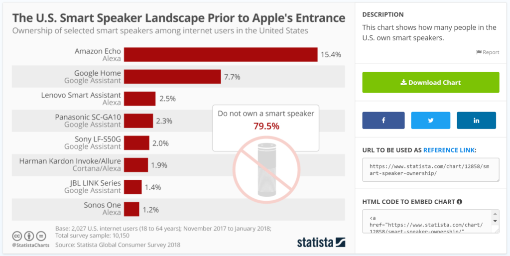
The statistics website, Statista, offers multiple ways to easily share its infographics as shown below. In addition to providing a download link, Statista also offers three social sharing buttons that will insert the infographic title as well as a link back to the details page. Below the social sharing buttons, Statista also provides a shareable link and HTML code so that you can embed the infographic on your own website. It doesn’t get any easier than this!

A lot of effort goes into making great content and we want people to share it, so get creative and make sharing easy. This is an area where friction is not your friend.
High-Quality Images and Video
A picture is worth a thousand words and the better the quality of the image, the better the quality of those thousand words. Photos and images help viewers quickly form an idea in their minds of what they will find on the web page or blog post. This, in turn, helps encourage them to read the text on the page and to share what they’ve read.
Video has an even greater impact on site visitors as it incorporates dynamic imagery, sound, pitch and tone, music, etc. As filmmaker Dale Sood explains in the video below, choosing video quality over audio quality will most likely work against you. People can follow good quality audio even if the video quality is lacking, but the same is not true the other way around.
Mobile vs Desktop Considerations
Statistics show that approximately 58 percent of website traffic now comes from mobile devices and this trend may continue to increase. When deciding what content to make available on your website, keep in mind that mobile users are at times on slower connections when traveling vs. in the office. It’s vital to optimize the experience by providing only the most important information to them when they are on mobile devices. Mobile visitors might not download a PDF due to time and data plan constraints, but they would most likely appreciate some way for them to bookmark the PDF or page. Many people will share content to their social media to be able to find it again and to have the reference in somewhat of a centralized place. For example, I will share interesting articles via Twitter to grow my network, but also to find it again by looking through the list of my tweets.
Although desktop traffic is less than half of website traffic, these visitors tend to spend more time per page on a site and tend to visit more pages, so be sure not to forget about this group. The larger screens of desktop and laptop computers provide a great opportunity to really show off stunning photos and videos as well as deliver a broader set of content. Engagement time increases on desktops and laptops since people are not as much “on the go” when using those computer types, which is a great time to encourage social media sharing by including these options within the sections of the content where it makes sense.
An Almost Great Example
McCall Handling Co. provides useful, easily-shareable daily forklift inspection checklists, useable by anyone in the industry that leverages McCall’s expertise and engages customers. As with most things in business, there is always room for a little improvement. McCall suggests that the checklists can be printed but didn’t make it as frictionless as possible. Adding simple links to download the images would have made it easier for most people to save the checklists to a computer. An even better option would be to display the links as buttons, so they are more visually appealing and more likely to be clicked. Take it a step further by including a “Print this Checklist” button to take more steps out of the process and add to the “cool” factor.
If you’ve read this far, you know this article is about making your site social media-friendly, so you should be asking “Where are the social sharing links for this awesome checklist?” That’s a great catch on your part so pat yourself on the back and be sure not to overlook this on your own website. But Israel, I don’t deal with forklifts. What awesome stuff can I share? Well, here’s a few suggestions:
- User guides
- Frequently Asked Questions (FAQs)
- How-tos
- Product use examples
Conclusion
I hope you’ve found some useful information in this blog post to help make your website social media-friendly. If you did, please share it with your friends through email and social media.


