
In the first article in this series, I introduced you to how Google Data Studio can help you more effectively communicate how your website is performing. In this article, I’ll introduce you to the Data Studio interface and help you connect it to Google Analytics. Before we get started, you’ll need to have a Google Analytics account and property already setup. Don’t worry if you don’t already have a Google Analytics account setup since Google provides a sample data source to experiment with.
Google Data Studio Series Index
Getting Started
Visit https://datastudio.google.com and login using the Google account that is linked to your Google Analytics account. Once you’re logged in, you’ll be greeted with the Data Studio Dashboard shown below. The sections with numbered circles are described below the image.
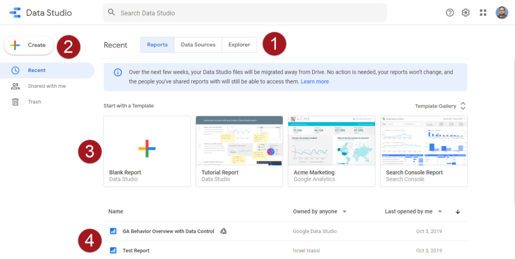
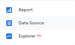
- This section has 3 buttons to choose between “Reports”, “Data Sources” and “Explorer”. We’ll be working with Reports and Data Sources in this article.
- In the left sidebar, you’ll have options to create new Reports, Data Sources and Explorer experiments. The “Recent” and “Shared with me” options are used to filter the list in section 4. The “Trash” option will show items you’ve deleted, so you can recover them, if needed.
- In section 3, you’ll see that Data Studio provides a “Template Gallery” that is helpful for getting started, exploring design and layout ideas, and learning just how powerful Data Studio really is.
- This section lists the Reports, Data Sources and Explorer experiments, depending on the options selected in sections 1 and 2.
Connect to a Data Source
We’re now going to setup a connection between Google Data Studio and Google Analytics, so that we can retrieve the data that will be used to create Reports. Click the “+ Create” button located in the top left corner.

Next, select the “Data Source” option.
In the next screen, locate the “Google Analytics” connector shown below.

Hover your cursor over the connector and click the blue “Select” option.

Next, click the Data Source title and enter a title that describes the data source you are connecting to. Since I manage reports for multiple clients, I find it helpful to include the connector type and client name in the Data Source title so that it’s easier to identify them.
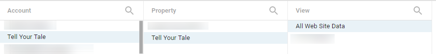
Below the title is a list of data sources available through your Google Analytics connection. Select the desired Google Analytics Account, Property and View.
In the top right corner, select the blue “Connect” button to finalize the data source configuration.
![]()
The next screen will display a lot of options that can be overwhelming. For the purposes of this post, we’re going to leave the options in their default state.
What’s Next?
If you’re like me, you’ll be tempted to click the “Create Report” and “Explore” buttons. Feel free to do so and experiment. In the next article, I’ll guide you through connecting the Data Source to the Report, along with some of the options available in the Reports, and provide examples of charts and tables that I have found useful. With each article, I’ll continue to expand the Terminology section below, so be sure to read through to the end.
Terminology
Connector: Connectors are software components that enable communications between your data and Data Studio. Connectors exist for many services such as Google Analytics, Facebook, YouTube and MailChimp. Some connectors are free, while others require a one-time license or subscription purchase.
Data Set: A data set is the information that will be displayed in the report. An example of a data set is the information contained in the rows and columns of an Excel spreadsheet.
Data Source: A data source is created by the connector and enables you to select the fields and options through the connector that will be used to create the Data Studio Report. A data source also provides a secure way to share reports and collaborate with other people.
Reports: Reports are the visualizations you’ve created, which is like workbooks in Excel. Reports can have multiple pages while displaying data from multiple sources.
Explorer: This option gives you a way to experiment with changes to a report without modifying the report itself. It’s a great way to safely add, remove or change tables, charts and other visualizations.


