
Welcome to part 3 of the Google Data Studio series, where I’m guiding you through connecting your data source to your first report, adding visualizations, and making basic styling adjustments.
Google Data Studio Series Index
Adding the Data Source to a Report
In part 2, we ended with creating a Data Source. Now we’re going to connect that Data Source to a Report.
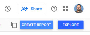
Click the blue “Create Report” button in the top right corner.
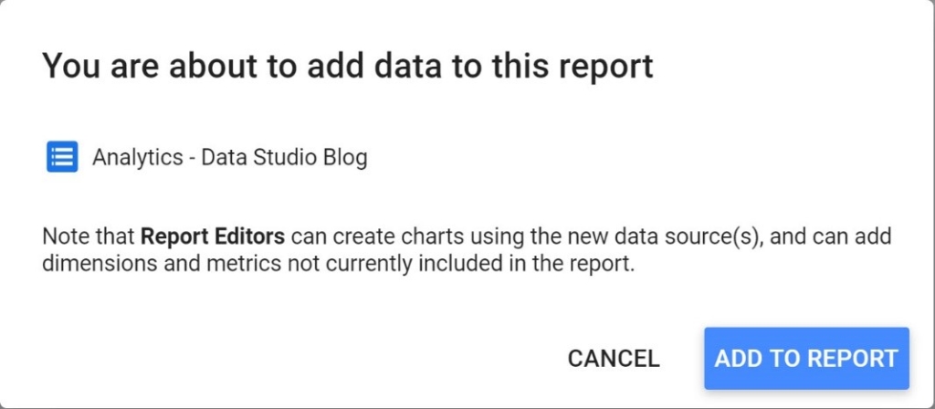
The next screen will ask you to confirm that you want to add the Data Source to the report. After reading the notice, select the blue “Add to Report” button to continue.
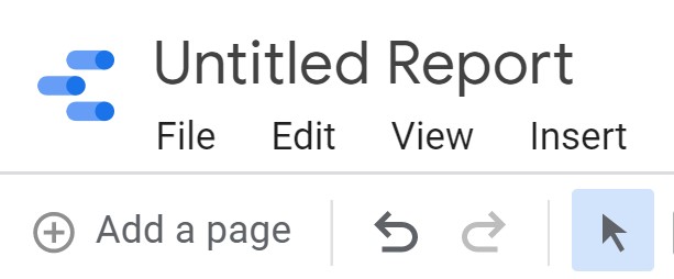
Finally, you’ll be presented with a blank Google Data Studio report as shown below.
![]()
Click the “Untitled Report” title in the top left corner and enter a descriptive title.
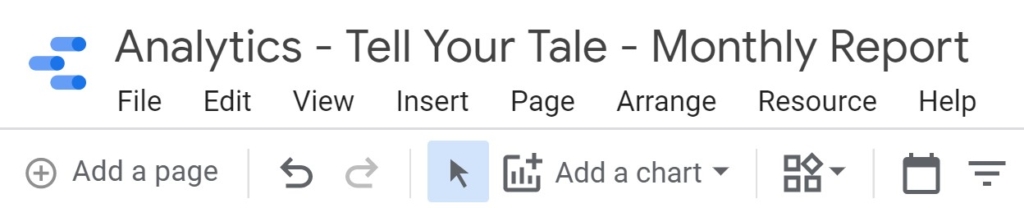
 In this example, I’m including the data source connector type, client name and report type to help make it easier to identify the report.
Report Interface Overview
The Google Data Studio report interface is very powerful and offers a wide variety of options. Instead of attempting to document every tool and option, which may change over time, I’ll focus on the features that apply to the examples being covered in this post.
Before we get into the details, it’s important to note the icon with 3 blue lines ![]() in the top left corner of every Data Studio page. This button will return you to the Google Data Studio dashboard, which you will use frequently. Notice also that there is no “Save” button since any edits you make are saved automatically.
in the top left corner of every Data Studio page. This button will return you to the Google Data Studio dashboard, which you will use frequently. Notice also that there is no “Save” button since any edits you make are saved automatically.
In the top right corner is a help icon shown as a circled question mark ![]() , which provides in-context help. The complete documentation for Data Studio is available at https://support.google.com/datastudio#topic=6267740.
, which provides in-context help. The complete documentation for Data Studio is available at https://support.google.com/datastudio#topic=6267740.
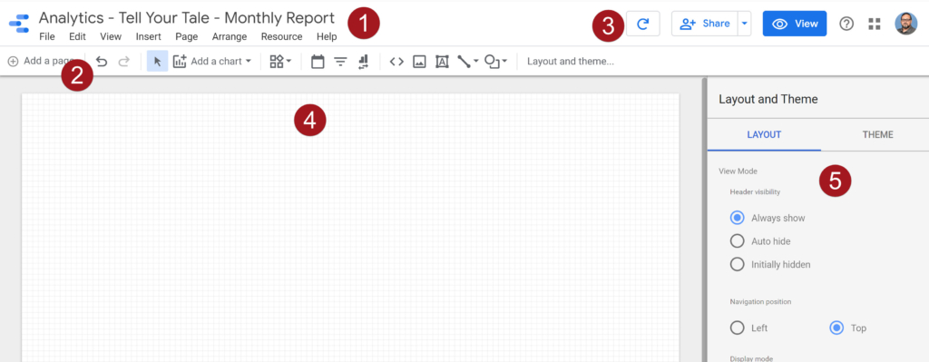
- The Report title and primary navigation contain many options that tend to be more of a higher-level function such as managing data sources, pages and other resources. Some of the options duplicate the toolbar beneath it, offering the ability to build reports in the method that works best for you.
- The toolbar provides a quick access method of adding pages, charts, text and filters to name a few options.
- When a data source is created, the “data freshness” is set by default to 12 hours. The first icon in this toolbar refreshes the data immediately so that you can work with the most current available data. The “Share” icon provides various sharing options including by invitation, scheduled email delivery, report link and PDF download. The “View” button displays the report as a report viewer would see it.
- The report canvas is where charts, tables, text, images and other visualization components will be placed. What is added to this area is what a report viewer will see.
- This section by default shows options for adjusting report layout and theme settings. Depending on the component selected, this section will display options for choosing data fields, making style adjustments, filtering options and many others.
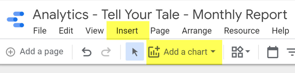
Adding a Table
Now the fun begins! From the main navigation area, select either the “Insert” menu item or “Add a chart” from the toolbar. I prefer to use the toolbar since it displays a thumbnail image of what the table or chart will look like.
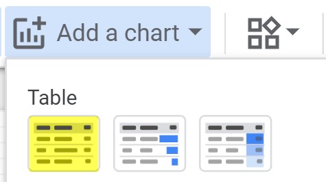
 I’m going to start with a basic table, so I’ll select the first option in the “Add a chart” dropdown list.
Place the table where you would like it to appear in the report.
 When starting with a new report, I prefer to add elements close to the right sidebar so that they are closer to their set of options.
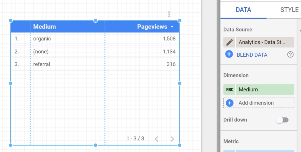
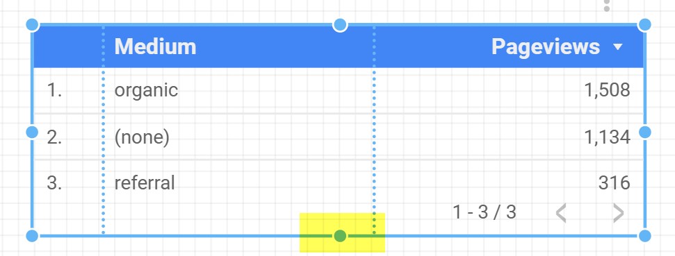
Using the bottom handle, I’ve resized the table so that it doesn’t take up any more real estate than needed.
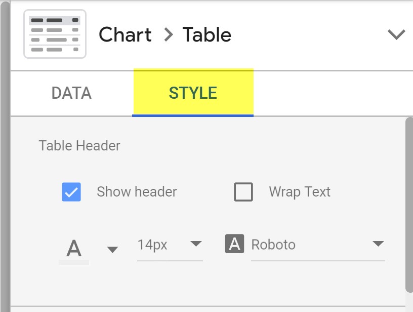
 This table isn’t very impressive and looks a little clunky so I’m going to adjust the styling. In the right sidebar, click the “Style” tab to access the table style options.
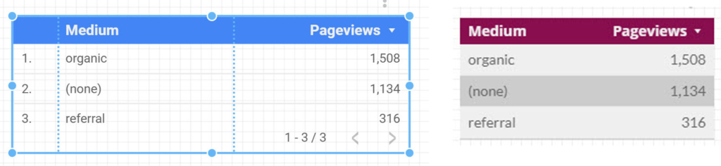
 The Style tab offers many customization options too numerous to document in this post. I’m going to adjust the colors, edit font style & size, remove the row numbers and delete the pagination. Below is the before and after view of the same table with the same data.
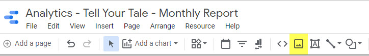
 Every good, branded report should include the client’s logo, so I’ll add that next. Click the image icon in the toolbar (highlighted in the screen shot below) above the report canvas.
 On the report canvas, draw the rectangle area that will hold the client logo. As with most things in Data Studio, it isn’t necessary to be precise since adjusting it later is very easy.
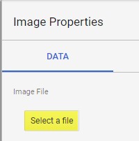
 With the image placeholder selected, click the “Select a file” button in the right sidebar.
 Data Studio will display the selected image in the image placeholder.
 Examples
We’ve successfully connected a Data Source to a Report, added and styled our first table, and included a client logo. This is a good time to show a few examples of what we’re going to build in future posts in this series.
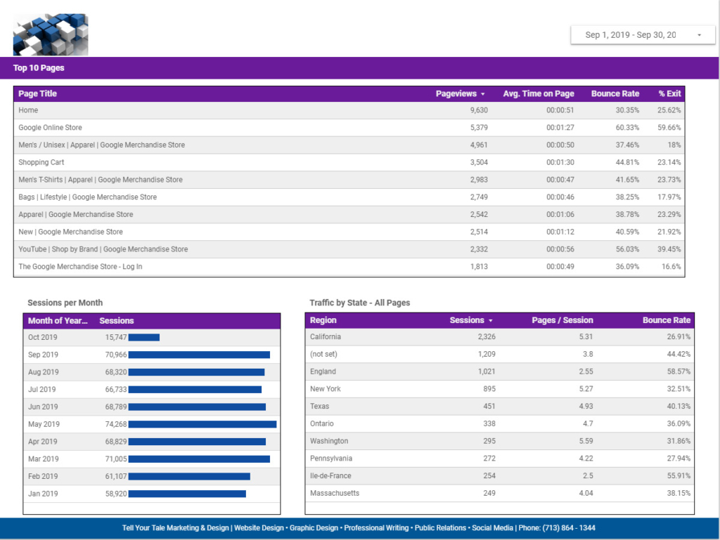
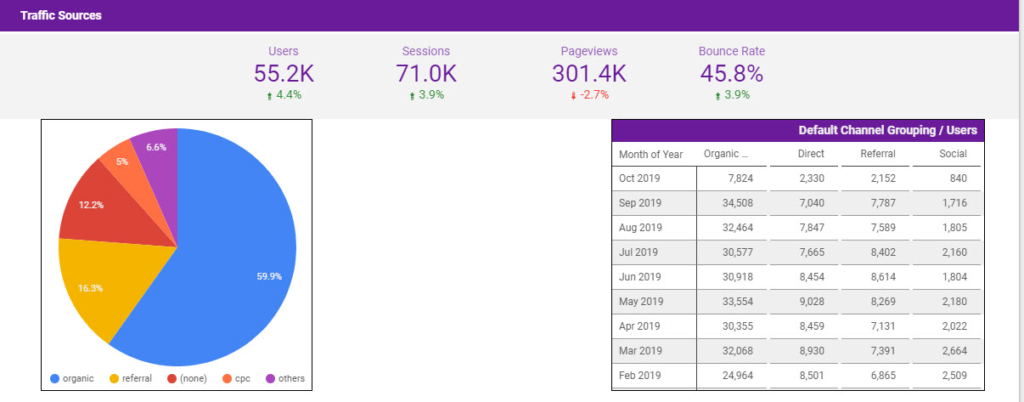
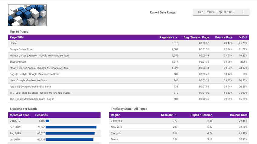
The below image displays a full page of a report, showing the use of a logo image, date selection control, branded style adjustments, custom table styling and a footer element that I include on all pages of the report.
 This next example shows more styling adjustments and different ways to display different types of data. This specific example is from a work-in-progress report, so there will be future refinements to the design.
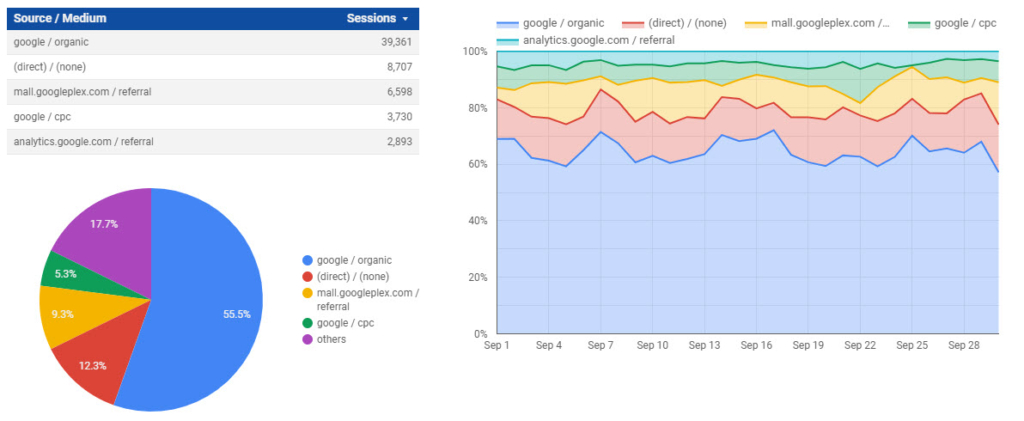
 The third example shows three different options to visualize the exact same data. Data Studio offers many options to clearly display data in legible, meaningful ways and effectively deliver a message with impact.
What’s Next?
In part 4 of this series, I will help set up a couple of visualizations using Google Analytics Dimensions and Metrics, so that you can start to build custom reports. I’ll also walk through setting up the footer area shown in the first example above.
Terminology
Connector: Connectors are software components that enable communications between your data and Data Studio. Connectors exist for many services such as Google Analytics, Facebook, YouTube and MailChimp. Some connectors are free, while others require a one-time license or subscription purchase.
Data Set: A data set is the information that will be displayed in the report. An example of a data set is the information contained in the rows and columns of an Excel spreadsheet.
Data Source: A data source is created by the connector and enables you to select the fields and options through the connector that will be used to create the Data Studio Report. A data source also provides a secure way to share reports and collaborate with other people.
Dimensions: Dimensions are attributes of your data. For example, the dimension City indicates the city, for example, “Paris” or “New York”, from which a session originates. The dimension Page indicates the URL of a page that is viewed.
Metrics: Metrics are quantitative measurements. The metric Sessions is the total number of sessions. The metric Pages/Session is the average number of pages viewed per session.
Reports: Reports are the visualizations you’ve created, which are like workbooks in Excel. Reports can have multiple pages, while displaying data from multiple sources.
Explorer: This option gives you a way to experiment with changes to a report without modifying the report itself. It’s a great way to safely add, remove or change tables, charts and other visualizations.


