It’s interesting that the World Wide Web (WWW) is 30 years old and has connected so many people, yet remains difficult to use for a lot of people. Those with vision issues may rely on screen readers. People with hearing issues may rely on text transcripts of audio content. People with limited fine motor skills may rely on keyboard navigation, instead of a mouse.
Many years ago, I was taught that computer networking is not that different from human networking. The basic definition given is that networking “is having something to share, deciding to share it and agreeing how to share it.” The primary reason the Internet and websites exist is to help people, businesses and computers to network. I was also taught at a very young age that “two brains are better than one”. We’re cheating ourselves, others and society when we limit access to our knowledge.
Accessibility is About Me, You and Everyone
Many discussions about website accessibility typically involve Americans with Disabilities Act (ADA)compliance rules and recommendations. We’re all disabled at some point in our lives and may eventually be disabled in multiple ways by the time we reach the end of our journey. From the moment we’re born, we begin to experience various types and levels of disability, such as not being able to use words to ask for food. As we get older, some of us develop issues with reading text that has a low contrast level relative to the background color as shown in the graphic below.

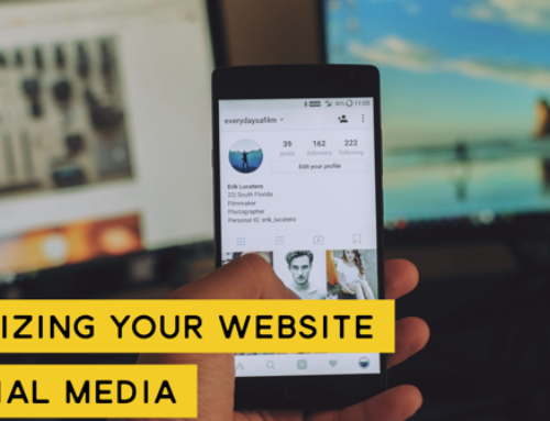
Using a screen reader, the “alt-text” associated with the images on websites can assist a visually impaired person to understand that a graphic exists and what its intended message is. When it comes to alt-text, it’s important to think in terms of the targeted disability, rather than your own ability, as well as the context of the image in relation to the text around it. For example, the Microsoft Word alt-text generator believes the image shown above to be a cell phone, although it did state that it was with low confidence. I’d be sufficiently confused and would skip over this section or move on to another website.
Disability can be permanent, temporary or situational. Permanent disability may result in reduction or loss of mobility, motor skills, vision, hearing, smell, taste and touch. Temporary disability might be loss of the ability to use an arm due to injury. Once the injury is healed, the disability goes away. A broken arm might mean you might not be able to lift certain things or have trouble opening doors. Situational disabilities could make it difficult to open a door because you’re carrying packages. This might not fall under ADA-compliance rules, but it’s certainly a situation that should to be considered when designing doorways. Website design should consider similar types of disabilities and how the design can be more inclusive to all.
“Design has this powerful ability to shift perceptions,
but it’s up to you to use it.” – Elise Roy, Inclusive Design Strategist
Design for Accessibility
Designing for accessibility is identifying a disability and designing a solution for that specific and usually permanent disability. Web designers tend to produce websites that work well for one extreme or the other. We assume visitors either see well or don’t see at all, which means we’re only addressing accessibility for two groups of people. Designing a website in this way means that our design doesn’t necessarily work well for people who have cataracts.
Design for Inclusivity
Microsoft’s inclusive design toolkit outlines three steps listed below to help us design in a way that includes as many people as possible.
- Recognize exclusion.
- Learn from diversity.
- Solve for one, extend to many.
In the first step, “recognize exclusion,” we’re challenged to identify biases that result in mismatches between people and their environmental and social situations. Pinpointing exclusions are opportunities to improve our designs and enhance interaction with many more people.
Inclusive design means not only designing for someone with a permanent disability such as blindness, but also designing for temporary and situational disabilities. How can a design for a blind person benefit a normally sighted person who is facing the sun? How does someone with one hand navigate your website compared to someone with a cast on their arm?
Step two, “learn from diversity,” is about getting input from diverse sets of people . Humans are highly adaptable and even somewhat rebellious at times. It’s likely that you’ve seen a sidewalk with the walk path branching off through the grass, caused by people using it as a shortcut. People will do the same with your web design, so it makes sense to include a larger group early in the design process.
In the third step, “solve for one, extend to many,” the challenge is to convert the diverse set of information you’ve collected and design a solution that goes beyond solving only for a specific disability. The blue, automatic door openers were designed to help people in wheelchairs open doors to enter and exit rooms and buildings. People carrying packages and walking on crutches figured out very quickly that it could help them as well. Web designers should apply this lesson to the digital world as well.
Summary
In this post, we’ve introduced the difference between designing for disability and designing for inclusivity. In the next post, we’ll dive deeper into inclusive design by looking at how inclusive design has been implemented and the impact delivered.
References & Resources
- Designing for Accessibility (Google I/O’19) – This is the video where Elise Roy discusses permanent, temporary and momentary disability.
- How A Screen Reader User Surfs The Web
- accessiBe – This service provides a script that is installed on your website to help with making the site accessible and compliant with the “AA” level of WCAG. The script provides tools to visitors that enable them to customize the user experience to work best with their specific disability.
- 7 Things Every Designer Needs to Know About Accessibility by Jesse Hausler


