
When working on marketing your business, there are some graphic design basics to keep in mind–whether you’ve hired a design firm like Tell Your Tale or are handling the marketing in-house. You always want to make sure you have the best type of files for the intended marketing use. Let’s go over the basics.
1. Size: Literally, how many inches tall and wide is your image?
2. Resolution: Is the file 72 dots per inch (dpi), 150 dpi or 300 dpi? Dots per inch (dpi) is used for print, while pixels per inch is used for the web and lines per inch is used for video. When printing, you really need files to be 300 dpi so that the files will print crisply and clearly. You likely have seen a print out where the image looks fuzzy or “grainy”. That’s likely because the image was only 72 dpi.
That said, for web purposes, 72 dpi images are just fine. Here’s another article online that talks about dpi in great detail for those of you looking to really dig into the subject. http://www.theimage.com/digitalphoto2/stillimages/howMany.pdf
3. Format:
PSD= PhotoShop format, which is not compressed and can be printed
TIF= very high quality but doesn’t go between PCs and MACs well. You have to tell a MAC to save the file as an IBM compatible file during the saving process so that the file can be used interchangeably between MACs and PCs.
JPEG= good file format for the web
PNG= okay for the web
GIF= very, very compressed file. It’s intended for the web or animation.
PDF = prevents many forms of copying or manipulating. Many times, designers will save their work in a PDF to present the artwork to a client so that the client can open and view the file, regardless of what software the client has on his/her computer. If a designer creates a file in Photoshop and sends that file to a client who doesn’t have the Photoshop program, the client will not be able to open the file.
4. Mode: This relates to how the colors in the image are read. The choices are RGB, CMYK or gray scale.
RGB stands for red, green, blue
CMYK stands for cyan, magenta, yellow and key (black). This is what folks in the industry refer to as 4-color process.
Gray scale means the image will be print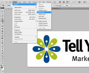 ed in black and white.
In Photoshop, you can see these options by going to IMAGE in the tool bar and then selecting MODE.
NOTE: When you change an image from RGB to CMYK, your image will automatically darken, so you definitely want to think about doing this first.
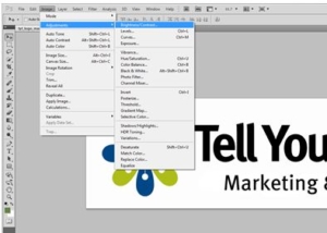
5. Correction: This addresses the color, lightness and cropping of your image. I suggest playing with these in Photoshop to get a good understanding of how they work. Of course, test this on a “TEST” image that isn’t critical to anything you’re doing. You access this information in Photoshop by going to “IMAGE” in the toolbar and then selecting “ADJUSTMENTS”. From their, a list of options appear including brightness, vibrance, etc.
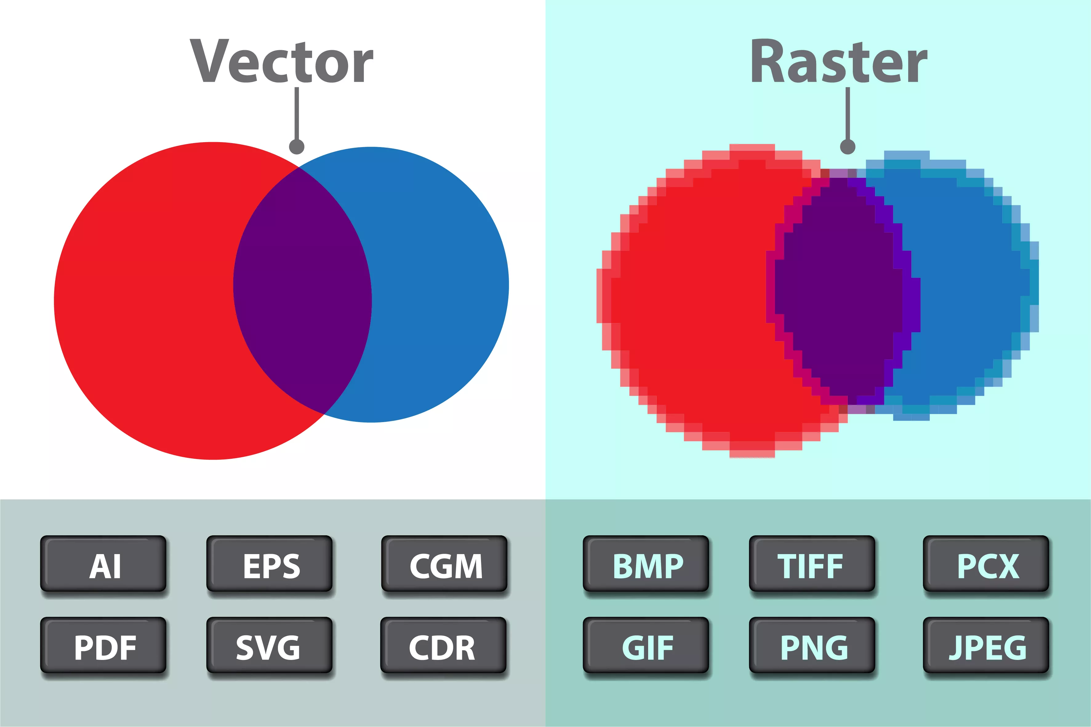
 One other important point that I’ll touch on is raster versus vector images. Raster images are made up of dots so think of numerous dots of color that come together to create a logo, a photo or other image. These images are fine for use on the web. In contrast, we have vector images. Vector is synonymous with the word “line”. Vector images are created in programs like Adobe Illustrator by drawing lines and curves. A vector image allows you to resize it from 1 inch by 1 inch to 1 mile to 1 mile (or any size in between) without the loss of image quality. So if you anticipate that you may need to resize an image, ask for a vector image.
Of course, if you’re just not sure how to handle these things, contact us at www.TellYourTale.com and we’ll be happy to help you with all your writing, web design and graphics.
-TYT


