

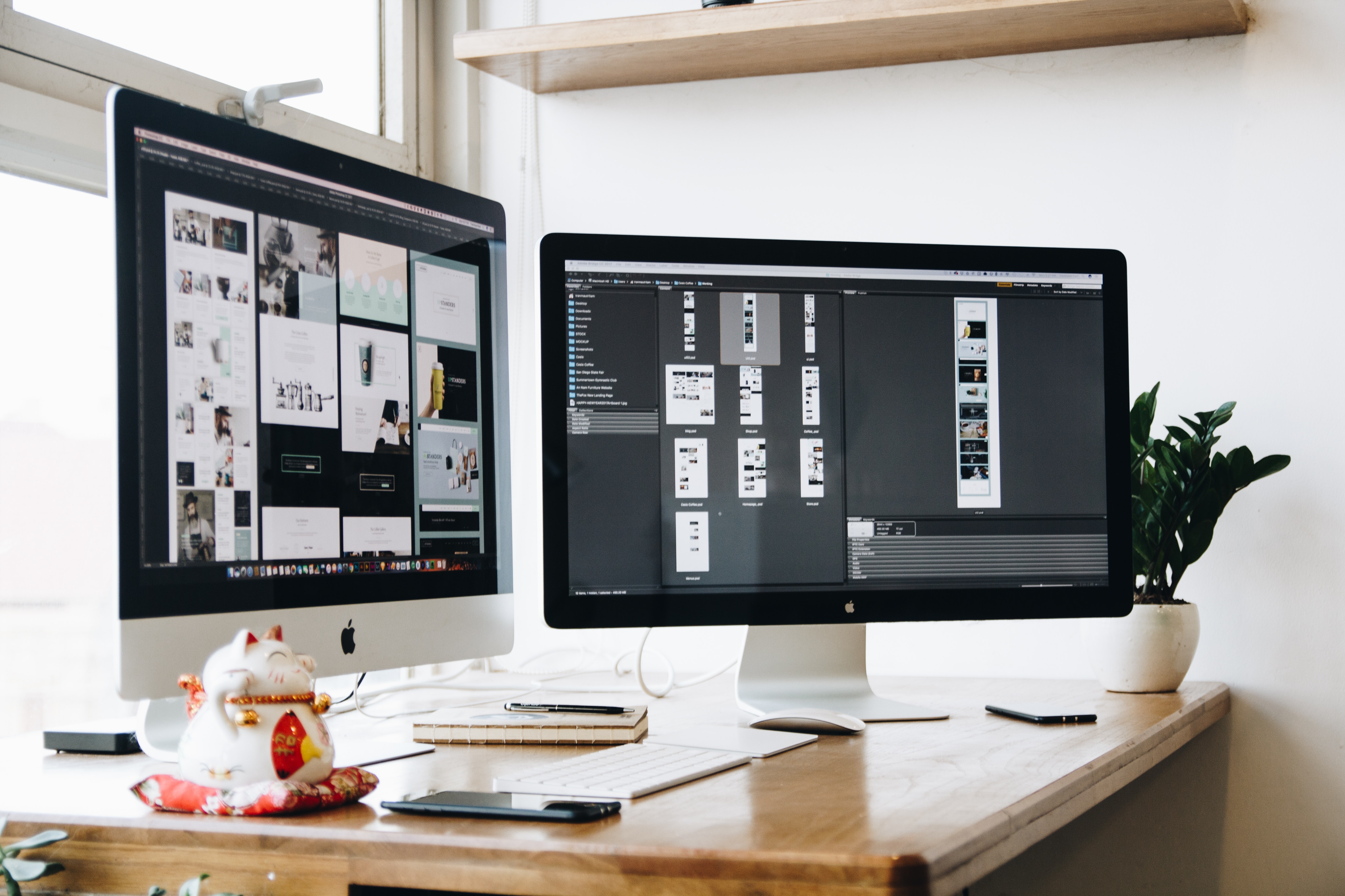
Low resolution, high resolution, which graphic file do you need when? Which graphic file format is best? We are frequently asked just this. The answer? How your graphics will be used dictates whether you need a low-resolution or high-resolution image. To further complicate things, business leaders often can’t open the art files because they don’t have (and don’t need) the graphic design programs (such as Adobe Photoshop, Illustrator and InDesign) used to create the graphics. In this post, we’ll explain those terms a bit and show examples of when a graphic file has been used incorrectly and how to correct it.
To start, it’s important to understand how graphics are created in order to know which graphic file format is best. Hang with me a minute on this. Raster images are made up of tiny dots of color that create the overall image. Raster images are great for use on the web. In contrast, a vector image is created using lines and curves. The powerful thing about vector images is that you can resize them from 1 inch by 1 inch to 1 mile by 1 mile without the loss of image quality because you’re technically extending the lines in the image. Remember in geometry class how you learned about a line going on for infinity? This is where that lesson comes into practice. So, if you anticipate that you may need to resize an image, ask for a vector image.
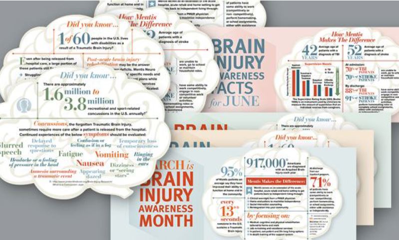
With this basic information on how graphic images are created, we’ll move to high-resolution (high-res) versus low- resolution (low-res). A high-res image is 300 dpi (dots per inch). However, since vector images are not made up of dots but rather lines, vector images are high resolution by nature. High-res images are needed when printing and here’s why. Have you ever seen a photo printed and it looks blurry or pixelated? That pixelation is caused when a low-res image (often 72 or 150 dpi) is used and is stretched to fit a larger area than the original images can accommodate. Some images are low-res from the start such as a blurry photo taken with a camera. Occasionally, a low-res image will appear fine on a computer screen, but once printed, the pixelation surfaces. If you take a 72 dpi image and enlarge it beyond its original dimensions, you’re literally spreading the same amount of color over a larger area. That causes “holes,” if you will, where the existing color blurs. That’s pixelation.
For most business leaders, 300 dpi images are great, although large format printing such as billboard signs may need even higher resolution. Your graphic designer should be able to guide you on that. I really like the “Raster vs Vector” post for a great header image that visually explains the difference between these two image types and has loads of great information. Another good resource is a former post of mine “5 Things to Check When Doing Graphic Design in Photoshop.”
So, when would you use a low-res image? Web pages load faster with low-res images. Just as email clients have limits on the file size you can email to a colleague, graphics embedded in emails to improve the visual appeal need to be lower resolution. MailChimp, a popular email service, recommends “a maximum file size of 1MB for images. 72 DPI is generally sufficient for the web, but isn’t required.”1
As a rule of thumb, I recommend always requesting high-resolution and vector files because you can always scale down in size. You can’t always scale up. If the image is going to be printed in any way, go with the highest quality image you can to produce crisp graphics. As in life, quality always shows.
- “Image Recommendations for Content Blocks” MailChimp.com
- “Raster vs. Vector” https://vector-conversions.com


